
Updated 2/2018
You’re So Vain, You Probably Think It’s About You
My in-laws are huge Carly Simon fans.
I’m sure it was at their house that I first heard Carly Simon’s, “You’re So Vain”.
My dearest sister-in-law probably played it for me while Ceci and I were still dating. A completely erroneous judge of my character as far as I’m concerned.
You might have noticed those four sentences are riddled with symptoms of a disease I call me-itis.
My, I’m, I, My, me, I, my, I’m. That’s 8 references to self in the introduction.
If your About Us page reads like a selfie, you’re in big trouble.
The top 7 mistakes people make when creating About Us pages:
- Talking only about you, your industry, your awards, you you you …
- Not including a clear benefit statement
- Writing in a boring or unnatural tone
- Using jargon or legalese that sounds like it came from a giant corporation without a soul
- Writing way too much without a clear message or scannability
- Hiding behind a corporate veil
- Not including a clear call to action
The top 7 tips to create amazing About Us pages:
We rounded up some real-life pages to help you create an effective About Us. You’ll see:
- Good and bad examples of About Us pages
- Guidelines on how to write your About Us page
- A ton of external resources to get you started
By the end of this, you’ll have a stronger About Us page designed to win more leads and customers.
1. Don’t use “About Us” as your page headline. Instead, use a unique value statement.
Actually, this applies to every single one of your web pages. Your homepage shouldn’t start with “Welcome to…” and your About Us page should not say About Us.
Bad Example #1

Bad Example #2

Bad Example #3

Here’s what all three examples are doing wrong:
- The use of generic and cliché images
- Using About Us as a headline and saying it multiple times
- Me-focused
- Using industry jargon
Great Example #1
CopyHackers’ About Us Page does it perfectly:

Joanna does a fabulous job of telling you immediately what Copy Hackers is about in the headline.
She immediately tell you, in a detailed, yet concise manner, that they’re about helping you with specific problems. And she doesn’t just use a vague statement like, “We’re here to help.”
When you land on Copy Hackers’ About Us page, you know immediately what they provide. And they aren’t afraid to inject a little bit of humor into their content.
I’ll be referring to Copy Hackers later in this post because they’re such a great resource.
Great Example #2
Here’s another example, this time from Shopify:

This is such a creative About Us page! Yet it’s not so over-the-top creative that it leaves you wondering “What the what is this about?!”
I love how Shopify teases you a little bit with their headline:
“The first Shopify store was our own”
Seven words pack a lot of meaning, implying they built Shopify because they couldn’t find anything on the market that worked for them.
And then there’s the image of the flag, their stake in the ground. They are about “making commerce better for everyone“.
That’s their vision. There’s no denying what their ‘why’ is. And it started by solving a problem. People connect with that purpose.
2. Make sure your About Us page isn’t about you, but about building a relationship
The About Us page is one of the most valuable pages on your site and gets a lot of traffic.
Making a good impression with a well-designed website is not enough by itself. If it lacks substance, prospective clients will just click away … no matter how much you paid your web designer.
That’s why it’s important to have a visitor-centric About Us page that will help your visitors feel more comfortable with you and your business. Think of it as a connecting point — a way to build a relationship with prospective clients.
Yes, tell them more about what makes you, your business, or your product tick. But more importantly, tell your reader what you can do for them.
How to build a relationship on an About Us page
- Answer the question your visitor is asking themselves: “What’s in it for me?” Narrowed down to it’s simplest function, your “About Us” page should outline the benefits for your visitor.
- Talk about how can you help solve their problem. Introduce yourself by showing them what you can do for them and what you’ve done for others. Talk about how your service got results for a client (hello, testimonial!). Help your visitor see themselves in the shoes of your clients. The more they can identify with your service, the more likely it is they’ll trust you and choose you over any other competition.
3. Be compelling. People will read a lot of text if it has value
Tim Ferriss has an About Us page that is 580+ words long.
That’s about two sheets of printed paper. And yet, you are pulled in by a New York Times quote that gives him credibility and sets him up as an authority:
“A cross between Jack Welch and a Buddhist monk.”
To the right target audience, that makes you want to read more.
CBS News has a story on how to write a better about us page that gives a great example of being boring versus engaging…
Imagine you channeled your inner Bernie Madoff and desperately need a lawyer. What do you want to read on a law firm’s About Us page? Would you hope to see this:
“The stability and continuity of Acme Law Firm provides a perspective that considers both your immediate and long-term interests through wisdom borne of participation in thousands of legal scenarios…”
Or this:“If it’s humanly possible, we’ll get you off. In the last ten years we’ve won 97% of our cases. We’re all divorced because we never go home. Granted, we do socialize, but only with judges we’re actively corrupting. We regularly face ethics violation proceedings because we only recognize a line when we’re stepping over it…”
Sure, this example is intentionally over the top to make a point — but unless you like the thought of three hots and a cot, you’ll call those second guys.
4. It’s better to talk like normal people than to lose your visitor in jargonese
Bad Example #1
“Acme Consulting is a global network solutions provider, redefining enterprise networking and connectivity by consistently providing outstanding customer experiences and innovative, world-class services.”
They’re not really saying anything and you tuned them out eleven words in. Here’s a third example of what NOT TO DO.
Bad Example #2
“Your Health Is Our #1 Priority. Our company is committed to providing the best quality service or product for our customers. Our goal is 100% customer satisfaction and to be industry leaders in the field of [My-Me-I]. We deliver the highest return on investment and maximize output for higher client efficiency.”
Bottom line, write how you speak. I give you permission to get on your high school English teacher’s bad side.
Recall a conversation that concluded in a sale with your client, and start writing out all the statements that helped your client trust you and convinced them that you were their best option.
Or think of how you would recommend a movie to a friend, or try and convince Grandma to try sushi. That’s how you should write.
5. Make it easy for visitors to scan
every page on your website
I recently attended a webinar hosted by Michael Hyatt and he had this to say:
“People read more now then they ever had in the past. At the same time, because there’s so much information out there, people are scanning more than they are reading word for word.”
I realize that most people won’t read the bulk of this post.
A few will, but not many. (Thanks for reading this Mom and Dad! Don’t forget to share it on Facebook!!)
I also know that a great many of you will scan through this article.
That’s why I’ve created subheadlines
that look like this
- I provided you
- with bulleted and
- numbered lists
- like this…
Wrote short sentences.
“And created block quotes in several places — like this one — and added images that support this story.”
All of this is to help break up the text so that you can scan it and still get the gist of what this page is about. Every point leads to the next, to lay out a clear, scannable message.
6. Don’t hide behind a corporate veil. You’re not Apple with 2 million U.S. employees.
People want to actually know who you are!
 Don’t use this picture or anything like it. It’s so 1990’s. Use a real picture of you and your team, preferably with your clients. And ditch stock photos.
Your client isn’t going to connect with a faceless silhouette or a stock photo model — they want to connect with you. One of the great benefits of living in the digital age is that almost anyone can take a good photograph.
Whether you hire a professional photographer or use a personal smartphone to take some candid photos at work, take the initiative to showcase your real-life business.
7. Tell your visitor what you
would like them to do next
The call to action is one of the most important parts of your sales copy. In fact, Dan Kennedy, one of my first mentors in the world of selling in print, teaches:
“After the headline, the call to action is the most important element of successful copywriting.”
Why is that?
Because you want to guide your visitor along and show them the road you laid out for them. Copy Hackers also lays out a clear reason to have a strong call to action:
“It’s probably one of the biggest missed opportunities on the web. Your web visitors are so interested in you that they’ve clicked to read your About page. You’ve engaged them with your story. Now what? Nada? Nichts? Nothing?”
Your call to action is the place to tell your visitor the next step. What do you want your visitor to do next? Here are some common CTAs to use:
- Download a free resource
- Sign up for your service
- Order/purchase a product
- Get started with a free trial
- Visit a landing page on your website
- Sign up for your email list
- Leave a comment
- Pick up the phone to call you
Always have a call to action that is 1) clear and easy to understand, and 2) is benefit-driven.
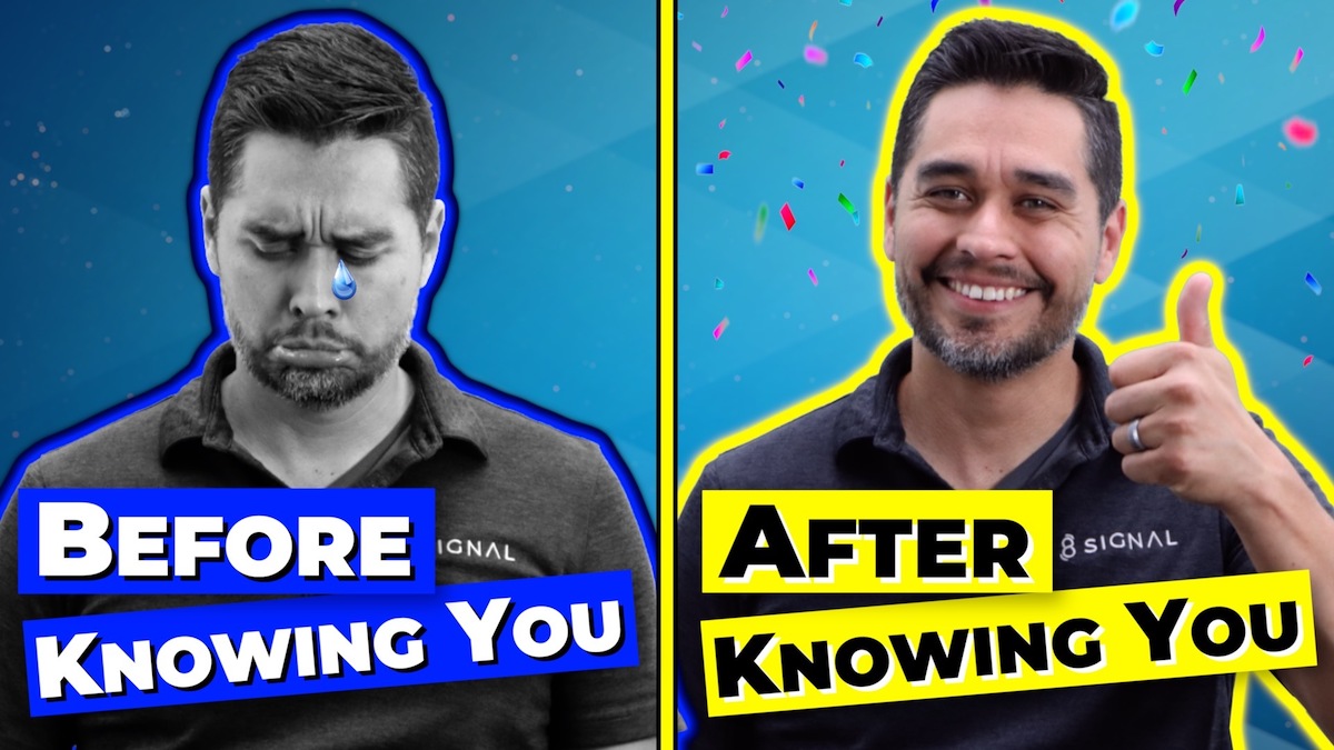
Here are a few before/after examples:

When it comes to getting your site visitors to the next stage, these subtle differences can mean the difference between crazy success and failure.
A strong About page can distinguish your business from competitors by being customer-centric rather than company-centric.
Still feeling a little lost or overwhelmed when it comes to your About Us page?
Call us today and let 8 Signal do the heavy lifting for you!
Dial (915) 585-1919 and or click here and let’s set a time to meet 🙂
(Psst. ↑ There’s our call to action)
Now we’d like to hear from you. Leave us a comment and let us know what your pet peeves are when it comes to About Us pages.